"Continued Colonies: The New Human Landscape"
 I like any song I have never heard before and going places I have never been. Reason enough to go to "Paint with Paint" on Friday. "Continued Colonies: The New Human Landscape", featured emerging artists from both the St. Louis and Metro East re
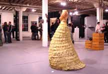
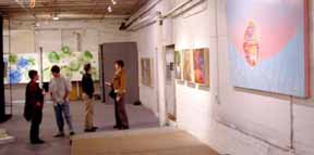
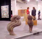 gion. A former paint factory warehouse was transformed into a showcase for their talents. The show was mostly student work from my old alma mater SIUE. (BS CS) Though the main space is huge, it was still filled as nearly twenty artists were involved. Mostly paint, some ceramics, embroidery on paper, sculpture as well several indefinable conceptions which apparently leaked from the confusion of the student mind. The complex has been developed by artist Tim Ayres, a most gracious host and all around fun guy. He and I share common interests: family, construction, photography and paint. When I told him I went to SIUE, he mentioned "The Mississippi River Festival" We were the only ones there old enough to know what it was.
The building aged gently, but with character. In some areas, more character than the art. Viewing art in this setting is different. It is naked of fine wall for display. One needs to focus from distraction. On the other hand, the distraction was great fun. We really enjoyed this one.
"Over hung" show or "Hung over" critic?
I have never read an article by Post-Dispatch Visual Arts Critic David Bonetti. I have always heard they suck. However, I just learned he panned a show I enjoyed, "
Exhibit at David Gallery is overhung, underwhelming". I decided to check it out. Wow, he sure gets grouchy if the pictures aren't hung just the way he likes them.
Anyway, I though I might review his review.
No sooner than I started, I had to stop and look up "eponymous". Really, such osteutatious vernacular. Also, there are some cliches which should not be given the light of day. It is a boring roll call article without reason. The whole premise is based on a holy grail. Some divine order of hanging. This is fine, but what is it? If there are specific guidelines, what are they. To approach this would require a bare minimum of writing skill, but even so, has been left undone. Just how close can one hang a velvet Elvis next to a three Stooges poster?
The approach of his article is overwhelmingly one sided. This leads me to question his sincerity. Does he really believe all this? Could this be an honest mistake, born from the frustration of an impotent pen? Not buying it.
The bit about new trends traveling slowly in the river city is most telling of all. Treating art as pair of designer jeans, to be discarded with last years fashion. It is not that he "doesn't get it", he is clueless.
As any fool can see, it is easy to rip something. It is even fun when applied with wit. (obviously not the reason here) The greater challenge is to appraise good art in a meaningful way. The greater challenge is to find the positive. This is not simple. Much of what we see in art is not worthy of comment. My augument is that, if so, why bother. Time would be better spent looking to find something of value. Then write. "Don't criticize what you can't understand". Bob Dylan said that. "Don't be condescending to your superior" I said that. Wonder what Abraham Lincoln would say.

When visiting an art opening in a room full of strangers, how does one pick out the artist? The artist's name was "Sarah" and thus ruled out many of the men. I had met Alicia La Chance at her show in Atomic Cowboy so I knew it wasn't her. I settled on the lovely young pretty whose eyes danced with pride.
"Are you Sarah?"
A smile and a nod invited approach.
"Tell me about your art."
I knew immediately this was a clumsy thing to say. It wasn't even a question. It was a statement, vague beyond relevance. I tried to rephrase and we stumbled into conversation.
She told me she has recently moved to Saint Louis from western Missouri and that she strives to incorporate the rural elements of her past blended with urban concepts derived from our City.
Transition is represented through symbolic representation of doors. Something to do with dreams and elements of nature.
I admit limited understanding. I often have trouble with intellectual description of abstract visuals. I don't get it, but, I did ask for it, and, I will admit, when I think about it, the work does have an urban feel to it.
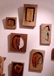
The work is indeed interesting, even beautiful. Large for paper, in enamel and oil. Bold in color but not screaming brightly. Different colors, working well together. Many, many layers developing deeply rich textures. Drawing is added, many small elements, some in repetition, some with very fine line. I haven't seen much like it so will venture to say i

t is original.
Two other types of work are presented: pen and ink on paper and ceramic with wood. Smaller than a bread box. The pen and ink is comprised of a multitude of very fine lines, mostly straight. Once again, unlike anything I have seen. The ceramic work includes fauna which is where aspects of nature are evident.
The food and wine provided by Sasha's was unbelievable.
Sarah Giannobile
November 4 - November 30th, 2005
Hoffman La Chance Fine Art Gallery
7533 Forsyth, Clayton MO
314 960 5322
 I like any song I have never heard before and going places I have never been. Reason enough to go to "Paint with Paint" on Friday. "Continued Colonies: The New Human Landscape", featured emerging artists from both the St. Louis and Metro East re
 gion. A former paint factory warehouse was transformed into a showcase for their talents. The show was mostly student work from my old alma mater SIUE. (BS CS) Though the main space is huge, it was still filled as nearly twenty artists were involved. Mostly paint, some ceramics, embroidery on paper, sculpture as well several indefinable conceptions which apparently leaked from the confusion of the student mind. The complex has been developed by artist Tim Ayres, a most gracious host and all around fun guy. He and I share common interests: family, construction, photography and paint. When I told him I went to SIUE, he mentioned "The Mississippi River Festival" We were the only ones there old enough to know what it was.